Welcome To Your All-In-One Advertisement Source
We're excited to be your first, last, signshop... you're advertising forever home!
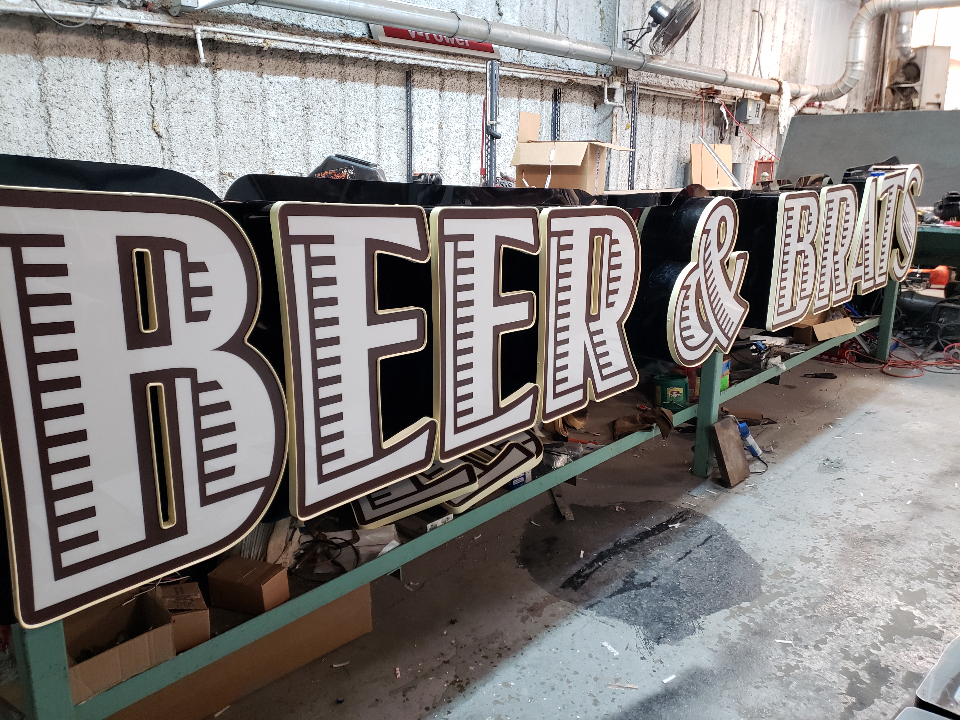
First slide Heading
First slide Caption
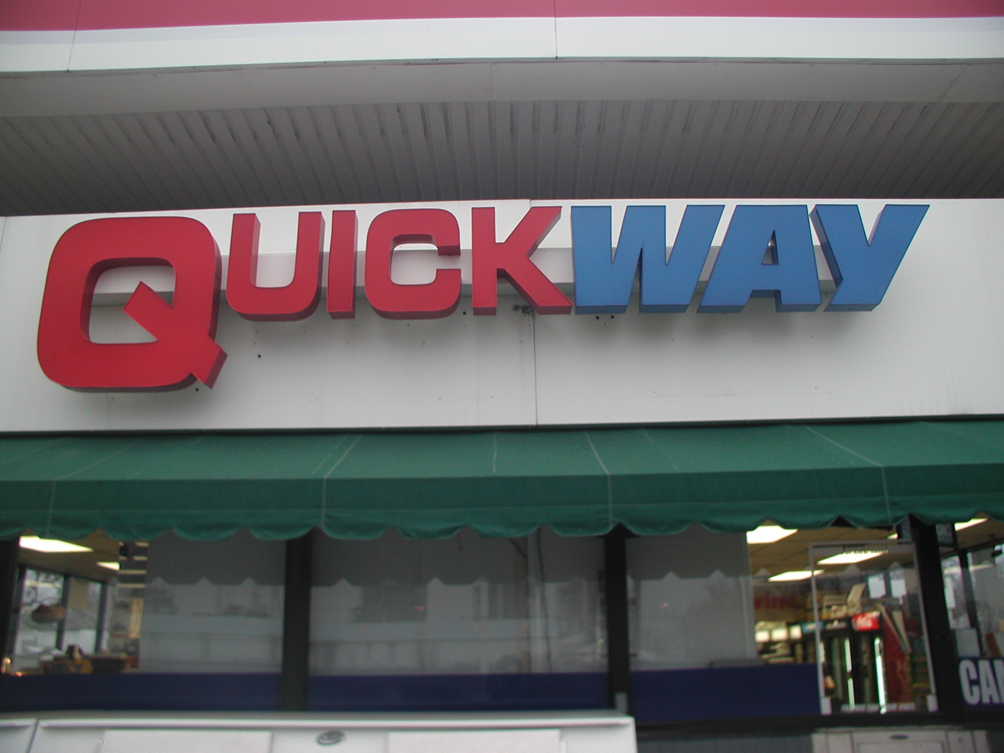
Second slide Heading
Second slide Caption

Third slide Heading
Third slide Caption
Previous Next
This is a simple hero unit, a simple jumbotron-style component for calling extra attention to featured content or information.
Learn more
Click outside the blue container to select this row. Columns are always contained within a row. Rows are indicated by a dashed grey line and rounded corners.
Card title
Some quick example text to build on the card title and make up the bulk of the card's content.
Go somewhere
Card title
Card subtitle
Some quick example text to build on the card title and make up the bulk of the card's content.
Card link
Another link
- Cras justo odio
- Dapibus ac facilisis in
- Vestibulum at eros

Card title
Some text to build on the card's content.
- Cras justo odio
- Dapibus ac facilisis in
Click here to select this column. Always place your content within a column. Columns are indicated by a dashed blue line.
You can resize a column using the handle on the right. Drag it to increase or reduce the number of columns.
You can offset a column using the handle on the left. Drag it to increase or reduce the offset.
Adding Buttons
Quickly add buttons to your page by using the button component in the insert panel.
Adding Badges
Using the insert panel, add badge to your page by using the badge component.
Info Badge Danger Badge
Copyright © 2020 · All Rights Reserved

